The UI/Visual Design for Legend revolves around creating a user-friendly, aesthetically appealing, and engaging interface that empowers high school students through their college journey. The use of clean layouts, visually impactful elements, and an intuitive flow ensures that students can navigate the app seamlessly while staying motivated and inspired.
UI DESIGN

branding
The name "Legend" was thoughtfully chosen to reflect the app's mission of empowering students to shape their own futures and become leaders in their educational journeys. The word "Legend" conveys a sense of greatness, achievement, and the idea of leaving a lasting impact. Rooted in the Latin legenda, meaning "things to be read," the name connects to the app's educational focus, guiding students to make informed decisions about their academic paths. Inspired by the Socratic method of learning, Legend emphasizes critical thinking, self-discovery, and personal growth, empowering students to write their own stories and become legends in their academic and professional lives.
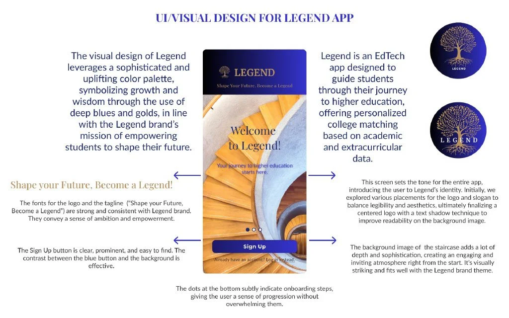
Color Palette: The colors chosen for Legend emphasize trust, wisdom, and achievement. Deep blues and golds convey stability, ambition, and growth, aligning with the educational mission of the app. Gold & Yellow accents symbolize achievement and excellence. Soft neutrals balance the palette by creating an inviting and friendly atmosphere for users.
Logo: The Legend logo features a tree symbolizing growth and wisdom, with deep roots representing the knowledge students acquire throughout their academic journey. The brand mark and variations consistently communicate Legend’s core values of empowerment and education.
ui/visual design


The tone of Voice: The brand voice is encouraging, supportive, and visionary. It aims to uplift students by providing them with guidance in a knowledgeable yet approachable manner. The tone remains empathetic, recognizing the struggles students face while inspiring them to believe in their potential.
Typography: Fonts like Playfair Display and Lato create a balance between sophistication and readability. The typography hierarchy effectively communicates important information while ensuring a polished look, aligning with the brand’s professional and academic values.
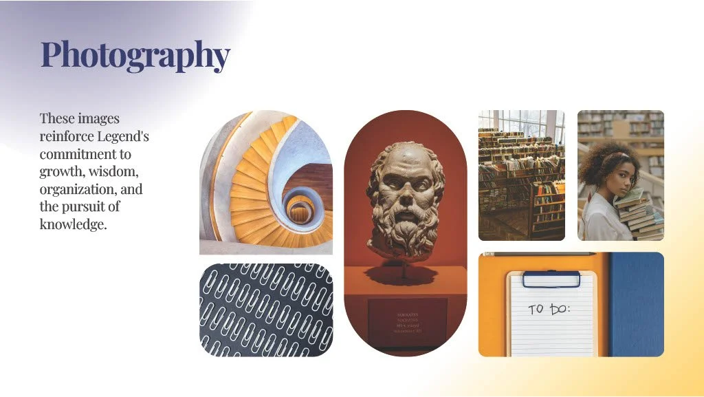
Imagery: Photography and iconography in the app reinforce Legend's core themes of knowledge, growth, and learning. For instance, the staircase imagery implies progress and elevation, tying back into the idea of students rising to their fullest potential.


The onboarding and welcome screens, iterated through several versions, reflect a clean, modern layout with enhanced legibility through the use of text shadows and thoughtful placement of elements. The design conveys clarity and ease of use, making sure students feel confident in navigating the app.